
When we design products, we aim to choose the best position for user interface components, placing the most important ones in the most accessible places on the screen.
Equally important is the design of communication. How many notifications are necessary? How and when should they be displayed? To answer this, we can be inspired by the principles of calm technology.1
Developed by Amber Case
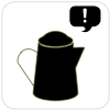
If a technology works well, we can ignore it most of the time. A teapot tells us when it is ready, and is off or quiet the rest of the time. A tea kettle can be set and forgotten, until it sings. It does not draw constant attention to itself until necessary.
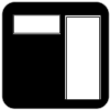
An inner office window provides an understanding of whether someone is busy or not without the need to interrupt them.
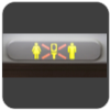
This simple display easily allows one to see whether the restroom on a plane is occupied or not. The message is universal and requires no translation.
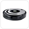
Roomba doesn't have a spoken language, just simple tones. This tone-based language makes it easy for anyone to understand what Roomba is saying, and eliminates the need to translate the tone into many different languages.
Roomba chirps happily when a task is finished. When Roomba gets stuck or needs cleaning, the device emits a somber tone. Orange and green status lights are secondary display that help communicate status in an unambiguous way.
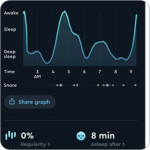
Sleep Cycle is a mobile application that monitors your sleep and allows you to track times of deep sleep and REM. Set an alarm and Sleep Cycle will wake you up before the time at the best place in your sleep cycle with a soft noise or buzz.
Because the haptic alert occurs under your pillow, you can configure it so that you can wake up without anyone else being affected by the alarm. SleepCycle rewards users with a sleep score, detailing how well they slept that night.

A smart badge is simple. Smart badges are small, wearable technologies that don't require a charger, user interface or operating system.
Simply touch a provisioned smart badge to a door or elevator panel and you'll easily gain access.
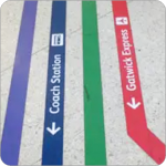
Floor navigation, when done well 2, can quietly show people where to go in unfamiliar spaces when traveling.
Using Bauhaus iconography alongside text can help with quick mental parsing of directions while providing detailed information.
Touch has a high resolution of human sensation. Information can be conveyed with no visual or auditory requirement.
Use haptics or touch to inform someone of important information. Many people set their phones to buzz, but other products such as the LUMOBack Smart Posture Sensor buzzes you when you exhibit poor posture.

A good trend graph is all about making the formerly invisible visible. The Sleep Cycle app graphs sleep over time, compressing that long term data into an easily accessible format.
Be patient: good data may take a long time to collect, but it is well worth the wait! Displaying data in a elegant way is one of the most important aspects of trend graphs. Elegance is about information and comprehension, not just visual appearance.
Status lights are fairly common on video cameras. A device is active when the red 'record' light is on. Status lights can be used for more than just recording. Our daily travels are mediated by the simple colors of traffic lights.
A light that shows the weather is far more calm than a weather system that constantly calls attention to itself. Think about how to use different colors of light to inform and encalm in your products.
A status tone is a quick way for a device to let a person know whether it needs attention or not.
Products that have a positive tones upon completion, or negative tones when stuck are more likely to be helped by their human owners.
A Status Shout is similar to a Status Tone but can be much louder and more urgent. Status Shouts should be reserved for very important information.
Smoke alarms, tea kettles and microwaves all use shouts to alert people to their status. Ambulances use Status Shouts to alert people to make way for an emergency. Tornado warnings shout: "take cover!"
Popup alerts are perhaps the most common form of alert, but they can quickly overwhelm people when not used correctly.
Alerts should be used when deleting important pieces of content, for an emergency, or when someone has specifically opted into a piece of content or stream. Otherwise, try to think of ways to alert a person using the other senses.
A simple status light on a timer can make for a calm and informative notifier.
An orange light that turns on at sundown or reminds you to brush your teeth.
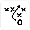
Use a delay or interrupt during a change of state.
For example, when the headphones of an iPhone become disconnected, the music player automatically pauses the music.
Amber Case at FutureSpaces in May 2024.

Visit the Calm Tech Institue Website! Launched May 2024.
1. Zampieri, Ornella. Customer Intimacy and Calm Technology. Wolters Kluwer | The Intelligent Solutions Blog. 07 Oct. 2011. Accessed 18 May, 2014. http://solutions.wolterskluwer.com/blog/2011/10/customer-intimacy-and-calm-technology/
2. Symonds, Paul. Colour Coding Signage for Easier Navigation. Wayfinding. 14 May 2023 Accessed 06 Jun, 2023. https://www.travelwayfinding.com/colour-coding-signage/
Have a suggestion for the Calm Tech Website? I'd love to hear from you!