Library of Delightful Interactions
Every tactile interaction sits on a spectrum of calm. This library documents physical interaction patterns with grades across five dimensions, cost bands, and specific guidance for making cheap components calmer. The goal is not to showcase what's ideal and leave everyone else behind. It's to show what's possible at every budget.
Expand any entry to see cost drivers, calm-with-cheap-parts patterns, real-world examples with buy links, and failure modes to avoid.
Why This Library Exists
Most consumer devices today are getting worse at physical interaction, not better. As products get "smart," they sprout push buttons, hidden modes, and inscrutable icon grids. Features multiply while usability declines. The assumption across the industry is that cheap buttons are "good enough" and that better controls are "too expensive." Scott Jenson, in his Design Can Be Free series, calls this out directly: the cost of bad hardware design is real, measurable, and usually avoidable.
Jenson identifies three qualities that make any physical control work: Discovery (can you see it, find it, and understand what it does without a manual?), Actuation (is the physical action obvious and reliable?), and Feedback (does the control confirm that your input was received?). These map directly onto the scoring dimensions used in this library. Discovery corresponds to Legibility and Appropriateness. Actuation maps to Delight and Error Resistance. Feedback is the core of Fault Tolerance.
The industry has settled into four common patterns that degrade these qualities. Toggling abuse: replacing a physical switch with a flat button removes visible state. Multiplexing: overloading a single button with tap, double-tap, and long-press sequences creates incantations instead of interactions. Deconstruction: splitting a rotary dial into up/down buttons destroys the natural acceleration and spatial memory of the original control. Mode abuse: making one button do different things depending on an invisible system state forces users to memorize rather than discover.
The library exists to give teams a concrete alternative. Every entry here documents a physical interaction pattern that avoids those abuses, grades it on a calm spectrum, and shows what it costs at three budget levels. The premise, drawn from Jenson's work and from CTI's certification framework, is that design improvement is often free or near-free. A $0.10 tact switch under a well-shaped cap with proper spacing and debounce is calmer than a $5 switch in a cramped, unlabeled layout. Better visual hierarchy, text labels instead of hieroglyphic icons, and proper defaults cost nothing in hardware. When better hardware does cost more, the library names the specific part, the price, and what you gain.
This library is not a catalog of luxury components. It is a practical tool for shipping calmer products on real budgets.
Scott Jenson's Design Can Be Free series is published at jenson.org. The framework above draws on his analysis of button abuse, analog control superiority, and the argument that good design does not require expensive hardware.
Switches
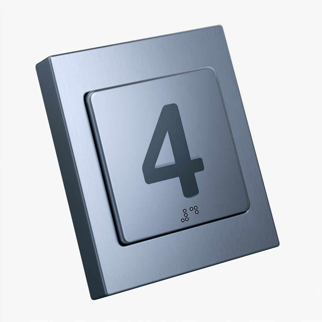
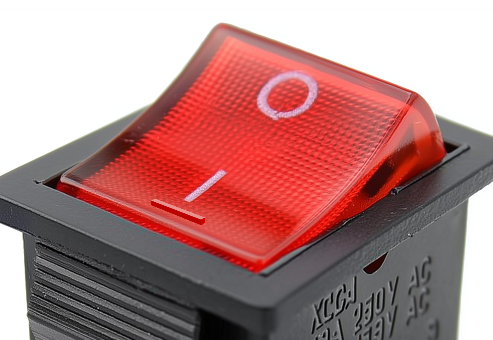
5 patternsSwitches give immediate tactile feedback confirming a state change. The snap of a toggle, the click of a rocker, the spring return of a momentary button. Each encodes a different relationship between input force, travel distance, and system response.


Rotary Controls
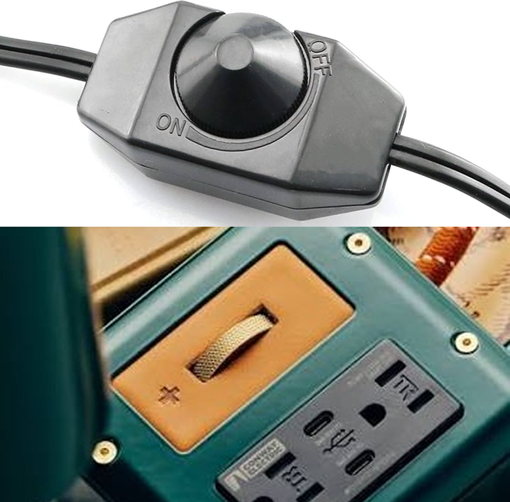
2 patternsRotary controls encode value in angle. A pointer on a dial, a detent on an encoder, a knob position on a stove. The hand wraps, the wrist turns, and the system responds proportionally. Rotational inputs build spatial memory: the user remembers where the knob was, not what number was on a screen.

Doors
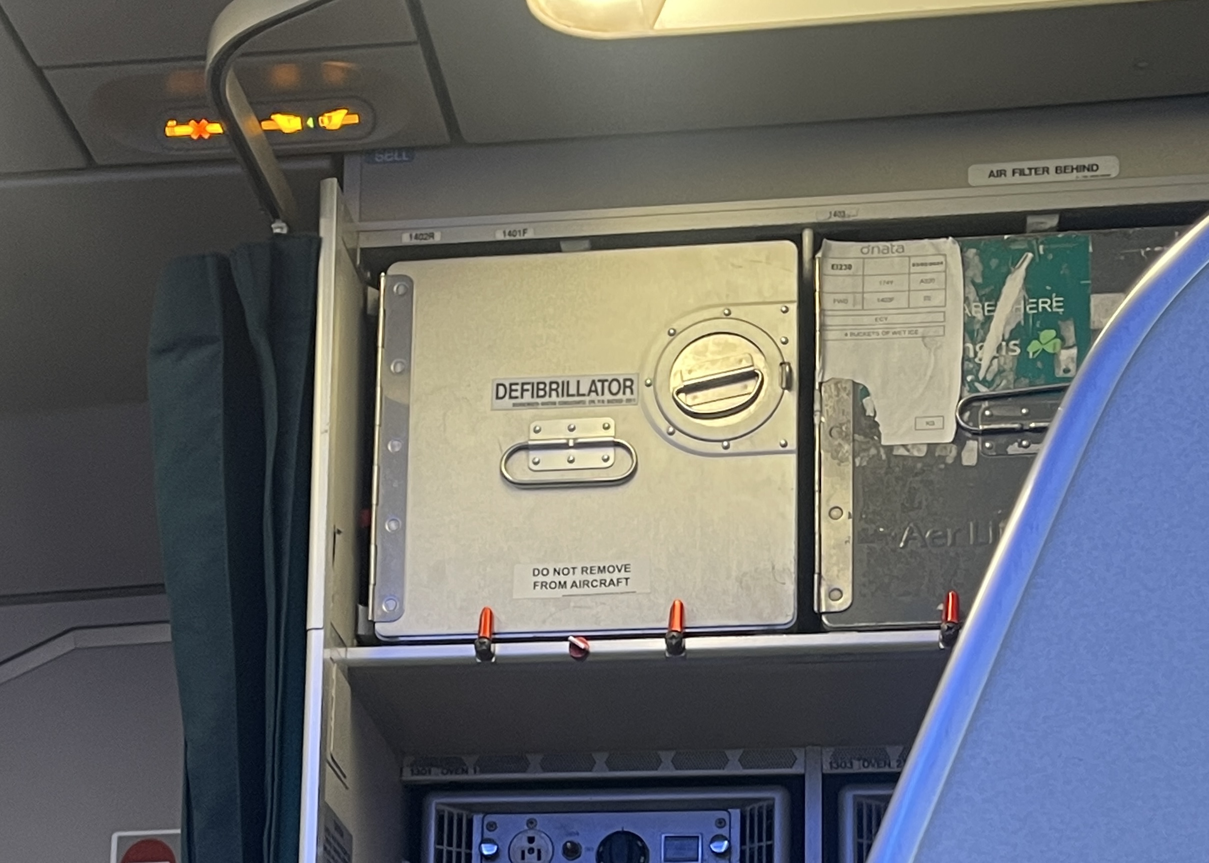
7 patternsDoors, panels, and enclosures communicate their operation through shape. A flat plate says push. A vertical bar says pull. A lever handle says press down. A quarter-turn fastener says twist to release. The best ones need no instruction because their affordance is the interface.

Foot Pedals
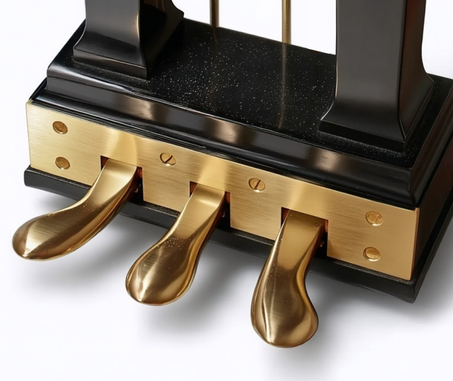
3 patternsFoot pedals free the hands for other work. A sewing machine treadle, a car accelerator, a sustain pedal. The foot provides proportional force control while the eyes and hands stay on the primary task. This is peripheral interaction at its most literal.

Output Indicators
4 patternsInputs are only half the interaction. The system must also communicate back: is it on, is it ready, what state is it in, how much is left? The calmest output indicators are readable from the periphery without demanding focused attention. A diffused LED glow, a needle position on a gauge, a shrinking colored disc, a mechanical flag. The output is the system's side of the conversation.
Common Anti-Patterns
These four patterns, drawn from Scott Jenson's analysis of consumer hardware, describe the most common ways physical controls go wrong. Each entry in the library references specific anti-patterns in its Failure Modes section. Understanding the category helps diagnose problems across entire product lines, not just individual controls.
Toggling Abuse
Replacing a physical switch that shows its state (up/down, left/right) with a flat button that looks the same in both states. The user loses the ability to check state at a glance. The fix is either using a control with visible position (toggle, rocker, slider) or adding an unambiguous indicator (LED, color change, physical displacement). A glass capacitive button with no travel and no indicator is the worst case: no feedback on actuation, no feedback on state.
Multiplexing
Overloading a single button with tap, double-tap, triple-tap, tap-and-hold, and combination sequences to access multiple functions. Each additional gesture hides a function behind a memorized incantation. The flashlight with ten button-press combinations and five strobe modes is the canonical example. The fix is either adding dedicated controls (a mode ring around the flashlight bezel) or reducing the number of functions to what a single button can cleanly handle (on/off only).
Deconstruction
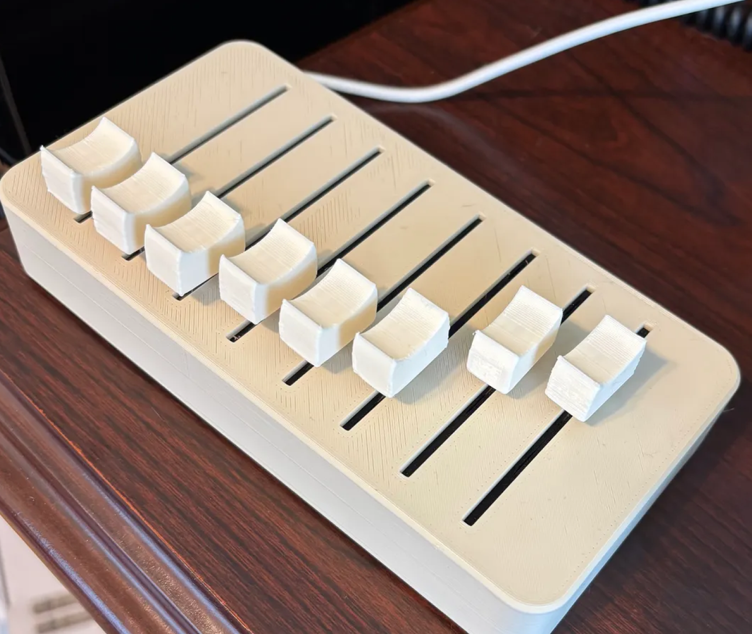
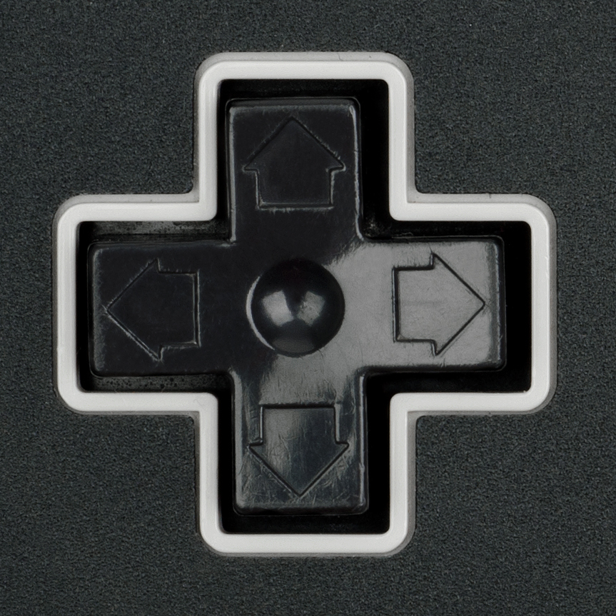
Splitting a continuous analog control (dial, slider, knob) into discrete up/down button pairs. The natural acceleration of a twist or slide is replaced with repeated presses or a hidden long-press acceleration mode. Overshooting becomes common, requiring "station memory" or preset workarounds that add complexity. The fix is using the analog control where the interaction is continuous (frequency tuning, temperature setting, volume). Where a button pair is unavoidable, firmware acceleration curves and visible position feedback (a progress bar, a numeric display) partially compensate.
Mode Abuse
Using a mode button to remap what other buttons do. The AM/FM toggle on a radio is a simple case. The worse case is when entering "clock set mode" silently remaps the volume buttons to hour and minute increment buttons. The user must remember which mode they are in, and a single missed mode press puts every subsequent input into the wrong context. The fix is separating the controls so each button always does one thing. Where modes are necessary, the current mode must be permanently visible, not just displayed briefly on a screen.
Touchscreen Displacement
Replacing a dedicated physical control with a touchscreen menu item. The control loses all three of Jenson's qualities at once. Discovery: the function is buried in a menu hierarchy instead of visible on the panel. Actuation: a flat glass surface provides no tactile targeting, so the user must look at the screen, find the control, and precisely tap it. Feedback: there is no travel, no click, and confirmation depends on the screen redrawing, which may lag. The canonical example is automotive climate control. A physical knob for temperature lets the driver adjust by feel without taking eyes off the road. A touchscreen version of the same control requires the driver to look down, navigate to the climate screen, locate the temperature slider, and tap or drag. The interaction that was peripheral becomes focal. The control that was always available is now behind a menu. The feedback that was instantaneous (knob position) now depends on software rendering speed. Touchscreens are appropriate when the task is genuinely complex, variable, or benefits from rich visual display (mapping, media browsing, text input). They are an anti-pattern when they replace a fixed, frequently used, single-purpose control that worked better as a knob, slider, or toggle. The test is simple: if the user needs to look at the screen to operate the control, and the previous version did not require looking, the touchscreen made the interaction less calm.
Scoring System
Each entry in this library is graded on five dimensions using a letter scale from A (excellent) to F (fails). The dimensions measure different aspects of calm quality. A cheap but robust, error-resistant button might grade C on delight and A on fault tolerance. That's a useful input, not a failure.
Delight and Sensuality
How satisfying does the interaction feel? The snap of a toggle, the weight of a knob, the click of a well-tuned tactile switch. This dimension is most sensitive to component cost, but layout, cap design, and firmware tuning can raise it 1 to 2 grades on cheap hardware.
Error Resistance
How hard is it to make the wrong input? Spacing between buttons, recessed switches, guards over critical toggles. A row of identical unlabeled buttons has low error resistance regardless of how expensive the buttons are.
Fault Tolerance
What happens when the user does the wrong thing, or when the component fails? A toggle switch fails gracefully: it's stuck on or stuck off, and you can see which. A touchscreen button fails opaquely: you don't know if the system received the input or not.
Legibility
Can the user read the state of the control without touching it? A toggle's position is visible from across the room. A flush capacitive button has zero legibility unless paired with an indicator. This dimension rewards controls whose physical position IS the readout.
Appropriateness
Is this the right control for this context? A rotary dial for volume control is appropriate. A rotary dial for entering a phone number is a relic. Appropriateness is not about the control itself but about the match between the interaction pattern and the task.
Cost Bands
Every entry annotates components at three price points. The goal is to show that calm quality is a spectrum available at every budget. A $0.10 tact switch under a well-shaped cap with proper debounce and spacing is calmer than a $5 switch mounted bare in a cramped layout. The library helps teams understand where to spend limited budgets for maximum calm return.
About This Library
This is a living reference of physical interaction patterns maintained by the Calm Tech Institute. Each entry documents how an object communicates its operation through form, material, and mechanism, and shows how to achieve that communication at different budget levels.
The library's intellectual foundation has two strands. The first is CTI's certification framework, which evaluates products across attention, periphery, durability, and sensory dimensions. The second is Scott Jenson's Design Can Be Free argument: that the majority of usability problems in consumer hardware are solvable with better layout, visual hierarchy, text labels, and defaults, often without changing the hardware at all, and that when better hardware does help, the cost is modest and the return is measurable in reduced support calls, lower return rates, and stronger brand perception.
The library is grounded in supply-chain reality. Entries include approximate cost bands, real-world product examples with buy links, specific part families from major manufacturers (Alps Alpine, Omron, C&K, NKK, Bourns, Grayhill, E-Switch, Marquardt, Panasonic), and explicit "calm with cheap parts" patterns that show how to get 40 to 60% of the ideal experience using stock, off-the-shelf components.
Entries are graded on five dimensions (Delight, Error Resistance, Fault Tolerance, Legibility, Appropriateness) using an A-through-F scale. The grading system is deliberately a spectrum, not a binary pass/fail. A cheap but robust, error-resistant button rates a C, not an F. The library helps teams talk about "how calm" something is at their actual price point and decide where to spend limited budgets for maximum calm return.
Additional categories and entries will be added over time. To add images, replace the placeholder elements with img tags pointing to your photographs.