Library of Delightful Interactions
Reference

Library of Delightful Interactions

Every tactile interaction sits on a spectrum of calm. This library documents physical interaction patterns with grades across five dimensions, cost bands, and specific guidance for making cheap components calmer. The goal is not to showcase what's ideal and leave everyone else behind. It's to show what's possible at every budget.

Expand any entry to see cost drivers, calm-with-cheap-parts patterns, real-world examples with buy links, and failure modes to avoid.

Why This Library Exists


Most consumer devices today are getting worse at physical interaction, not better. As products get "smart," they sprout push buttons, hidden modes, and inscrutable icon grids. Features multiply while usability declines. The assumption across the industry is that cheap buttons are "good enough" and that better controls are "too expensive." Scott Jenson, in his Design Can Be Free series, calls this out directly: the cost of bad hardware design is real, measurable, and usually avoidable.

Jenson identifies three qualities that make any physical control work: Discovery (can you see it, find it, and understand what it does without a manual?), Actuation (is the physical action obvious and reliable?), and Feedback (does the control confirm that your input was received?). These map directly onto the scoring dimensions used in this library. Discovery corresponds to Legibility and Appropriateness. Actuation maps to Delight and Error Resistance. Feedback is the core of Fault Tolerance.

The industry has settled into four common patterns that degrade these qualities. Toggling abuse: replacing a physical switch with a flat button removes visible state. Multiplexing: overloading a single button with tap, double-tap, and long-press sequences creates incantations instead of interactions. Deconstruction: splitting a rotary dial into up/down buttons destroys the natural acceleration and spatial memory of the original control. Mode abuse: making one button do different things depending on an invisible system state forces users to memorize rather than discover.

The library exists to give teams a concrete alternative. Every entry here documents a physical interaction pattern that avoids those abuses, grades it on a calm spectrum, and shows what it costs at three budget levels. The premise, drawn from Jenson's work and from CTI's certification framework, is that design improvement is often free or near-free. A $0.10 tact switch under a well-shaped cap with proper spacing and debounce is calmer than a $5 switch in a cramped, unlabeled layout. Better visual hierarchy, text labels instead of hieroglyphic icons, and proper defaults cost nothing in hardware. When better hardware does cost more, the library names the specific part, the price, and what you gain.

This library is not a catalog of luxury components. It is a practical tool for shipping calmer products on real budgets.

Scott Jenson's Design Can Be Free series is published at jenson.org. The framework above draws on his analysis of button abuse, analog control superiority, and the argument that good design does not require expensive hardware.

Calmness Grades
A Excellent B Good C Adequate D Poor F Fails
Cost Bands
$ Under $1/unit $$ $1 to $8/unit $$$ $8+/unit

Switches

5 patterns

Switches give immediate tactile feedback confirming a state change. The snap of a toggle, the click of a rocker, the spring return of a momentary button. Each encodes a different relationship between input force, travel distance, and system response.


your image here
Toggle
Toggle Switch
Audio gear, industrial panels, lighting controls
Binary state with visible position. Up or down tells you the current state from across the room. The lever position is the readout. No ambiguity, no LED needed, no screen. One of the clearest mappings between physical position and system state.
Delight
A
Error Resistance
B
Fault Tolerance
A
Legibility
A
Appropriateness
A
A
High on legibility. Lever position is the display.
Cost and Supply Chain
$ Stock plastic toggle
  • E-Switch or generic: $0.15 to $0.60/unit. Plastic bat, basic snap action. Feels thin but functional.
  • Cost driver: metal bat adds $0.30 to $0.80. Perceived quality jumps significantly.
$$ Mid-range metal toggle
  • C&K, Omron: $1.50 to $4.00/unit. Brass or steel bat, tighter tolerances, satisfying snap.
$$$ Premium sealed toggle
  • NKK Switches: $8 to $25/unit. Mil-spec sealed, illuminated, configurable throw weight. The reference.
Calm With Cheap Parts
  • Even a $0.20 toggle has the core calm property: visible position = visible state. Spend your budget elsewhere.
  • If using a cheap plastic bat, add a printed label or color band near the toggle to reinforce ON/OFF mapping.
  • Panel spacing matters more than switch cost. Place toggles 20mm+ apart to prevent accidental adjacent activation.
  • If you have +$0.50 to spend: upgrade to a metal bat. The weight change makes the interaction feel intentional.
Failure Modes
  • Unlabeled toggle in a row of identical toggles. Which one is the lights?
  • Toggle orientation inconsistent with convention (down = on) without clear marking.
  • Bat too short to see position at a glance. The whole point is peripheral readability.
Real-World Examples
  • $ E-Switch 100SP1T1B1M2QEH
    SPDT panel mount toggle, chrome-plated bat, 5A 120V. ~$3.16/unit.
    DigiKey
  • $$ C&K 7101SYZQE
    7000 series miniature toggle, SPDT, epoxy-sealed terminals. Long-life standard in telecom and medical.
    Mouser DigiKey
  • $$$ NKK MN12SS4W01
    M-series miniature toggle, SPDT, IP67 dual-seal waterproof. Chrome-plated actuator, 50,000-cycle life. ~$6.25/unit.
    DigiKey (M-series overview)
Why this is calm: State is encoded in physical position, not a software display. The user can confirm the state from across the room using peripheral vision. No battery, no screen, no failure mode that hides state. The toggle is one of the most legible input devices ever designed.
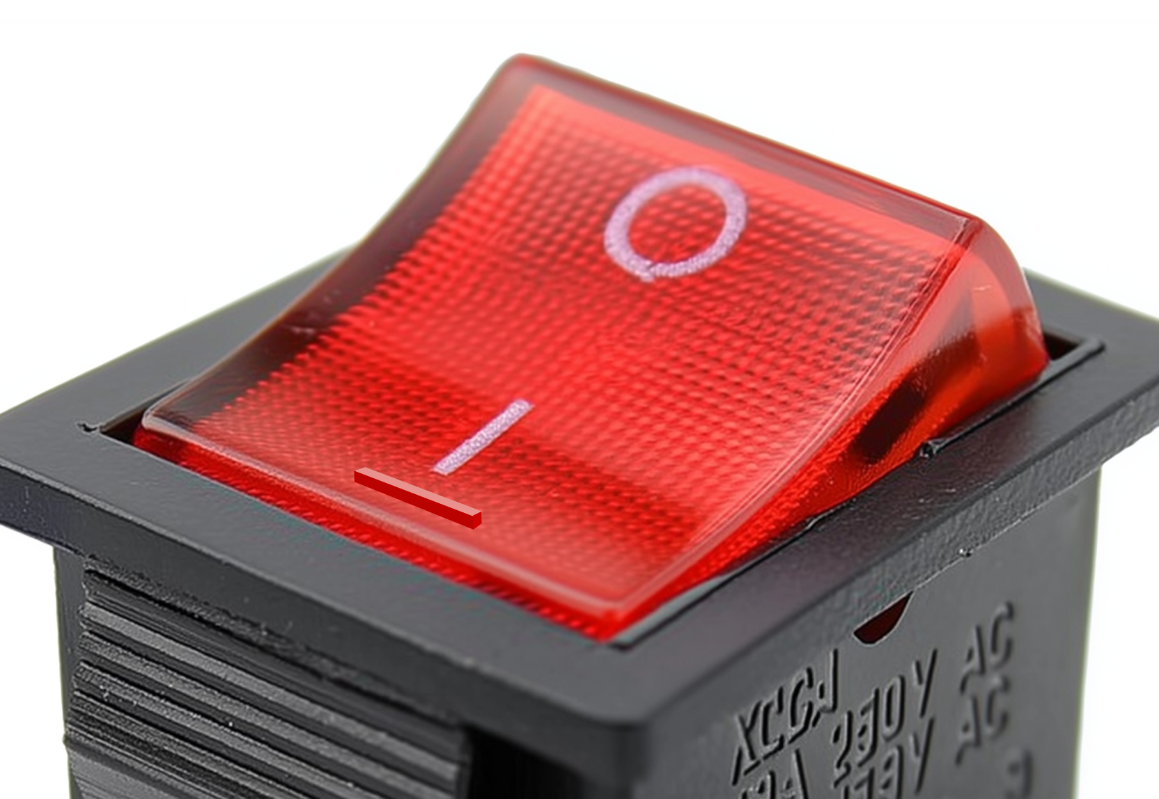
Rocker Switch
Rocker
Rocker Switch
Light switches, appliances, power strips, AV equipment
A wider surface area than a toggle. Easier to hit in the dark or with a loaded hand. The slight tilt of the rocker shows state, though less visibly than a toggle. A workhorse for binary on/off where the switch lives at hand height.
Delight
B
Error Resistance
B
Fault Tolerance
A
Legibility
B
Appropriateness
A
B+
Reliable and familiar. State tilt is subtle but learnable.
Cost and Supply Chain
$ Stock plastic rocker
  • Generic or E-Switch: $0.10 to $0.40/unit. Ubiquitous. Feels adequate. No tactile surprise.
$$ Illuminated rocker
  • Marquardt, C&K: $1.00 to $4.00/unit. Built-in LED indicator dot solves the legibility gap. Tighter pivot.
$$$ Premium sealed
  • NKK illuminated rockers: $10 to $20/unit. Programmable OLED display in the rocker face (SmartSwitch). Extreme.
Calm With Cheap Parts
  • The rocker's weakness is subtle state indication. A $0.05 solution: print or engrave "I" and "O" (IEC 5007/5008) on each side.
  • If the rocker controls something non-obvious (fan vs. light), use a pictogram label adjacent to the switch. The label does the work the rocker can't.
  • Recessing the rocker slightly into a bezel prevents accidental bump activation at zero additional cost (panel design, not switch cost).
  • If you have +$0.80 to spend: an illuminated rocker with a small LED dot is the single best upgrade for state visibility.
Failure Modes
  • No indicator: user cannot tell if it's on or off without checking the connected device.
  • Flush-mounted with no recess: gets bumped off by passing objects or elbows.
  • Identical unlabeled rockers in a row (power strip with 6 identical switches).
Real-World Examples
  • $ E-Switch R series
    Standard snap-in rocker, SPST or SPDT. Available with or without indicator LED. From ~$0.40/unit.
    Mouser (E-Switch rockers)
  • $$ Marquardt 1830 series
    Illuminated rocker with integrated LED. Tight pivot, clean snap, IP40. German-made. ~$2 to $5/unit.
    Mouser (Marquardt rockers)
  • $$$ NKK SmartSwitch JW/CW series
    Programmable OLED or LCD display in the rocker face. The screen IS the label. Custom graphics per state.
    NKK SmartSwitch
Why this is calm: The wide paddle surface makes it operable without precise targeting. In the dark, you find it by feel. The mechanical simplicity means the switch either works or it doesn't; there are no intermediate software failure states. The key calm improvement over a flat touchscreen button: no visual attention required to activate.
Momentary Push Button
Push Button
Momentary Push Button
Doorbells, elevator calls, arcade cabinets, appliance start buttons, medical devices
Active only while pressed. Spring return provides tactile confirmation of release. The quality of the "click" is where the full spectrum from crap to calm lives. A cheap dome switch and a well-tuned Alps tactile switch are technically the same interaction pattern with completely different felt experiences.
Delight
B
Error Resistance
C
Fault Tolerance
A
Legibility
C
Appropriateness
A
B
Delight varies wildly by part quality. Legibility depends on context.
Cost and Supply Chain
$ Stock dome tact switch
  • Panasonic EVQP or generic: $0.05 to $0.30/unit. Thin click, short travel. Functional.
  • Cost driver: the dome material (metal vs. rubber) accounts for most of the feel difference.
$$ Tuned tactile switch
  • Alps Alpine SKQG, Omron B3F: $0.40 to $2.00/unit. Defined click point, consistent force curve, satisfying return.
  • Cherry/ZF snap-action in the same range for micro switches.
$$$ Custom force profile
  • C&K custom tactiles, Grayhill pushbuttons: $3 to $12/unit. Specified snap ratio, custom actuation force, premium housing.
Calm With Cheap Parts
  • A $0.10 tact switch under a well-designed cap feels dramatically different than the same switch mounted bare. The cap is the interaction; the switch is the mechanism.
  • Button cap material and shape: a slightly concave surface guides the fingertip and provides proprioceptive centering at zero switch cost.
  • Debounce in firmware eliminates double-registration, which is the most common "crap" experience with cheap buttons.
  • If you have +$0.30 to spend: upgrade from rubber dome to metal dome tact switch. The snap ratio (ratio of peak force to contact force) is what makes a click feel good.
  • Spacing buttons 15mm+ apart prevents mis-presses. Free in the layout phase, impossible to fix later.
Failure Modes
  • Mushy feel with no clear actuation point. User doesn't know if the press registered.
  • No debounce: single press registers twice. The user learns to distrust the button.
  • Identical unmarked buttons in a cluster with no spatial logic.
  • Recessed button that requires a fingernail or pen tip. Excludes anyone without fine motor control.
Real-World Examples
  • $ Alps Alpine SKQGABE010
    SKQG series tactile switch, 5.2x5.2mm SMD, 50mA 12V. Clean click, low profile. ~$0.31/unit.
    DigiKey
  • $$ Omron B3F-1000
    6x6mm through-hole tactile switch. Positive click, 1M cycle life. The benchmark tact switch. ~$0.29/unit (volume).
    Mouser (B3F series) DigiKey
  • $$ Alps Alpine SKQGAFE010
    SKQG series, higher force variant (2.55N actuation). More deliberate feel, same footprint. ~$0.54/unit.
    DigiKey
  • $$$ Omron B3F-3152 (gold-plated)
    Gold-plated contacts for corrosive environments. Higher contact reliability. Projected plunger accepts B32 key tops.
    Omron B3F product page
Why this is calm: The momentary button is the simplest cause-and-effect input. Press, something happens, release, it stops. There is no state to remember, no mode to be in, no risk of leaving something on by accident. The spring return is the system telling your finger "I got it, you can let go now." That return force, that click, is the channel through which calmness is communicated.
Slider / Fader
Slide
Slider / Fader
Mixing consoles, lighting boards, HVAC panels, synthesizers
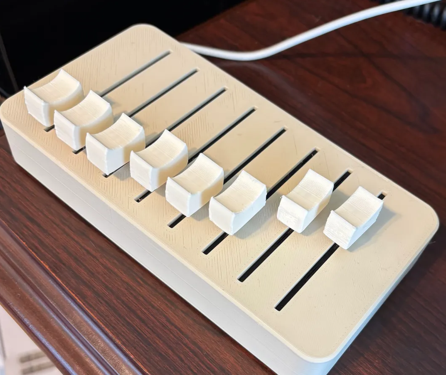
Linear travel maps to a continuous value. Finger position is the readout. You can see the current value of every channel at once without touching anything. In a mixing console, the fader positions are a real-time peripheral display of the entire system state.
Delight
A
Error Resistance
B
Fault Tolerance
A
Legibility
A
Appropriateness
B
A-
High legibility. Fader position is a real-time peripheral display.
Cost and Supply Chain
$ Stock slide potentiometer
  • Generic slide pot: $0.30 to $1.00/unit. Scratchy feel, short travel (30mm to 45mm). Functional for prototyping.
$$ Quality 60mm fader
  • Alps Alpine RS series, Bourns: $2 to $6/unit. Smooth travel, consistent resistance, 60mm throw.
  • Cost driver: fader length. 60mm is minimum for fine control. 100mm is standard for professional audio.
$$$ Motorized fader
  • Alps Alpine RSA series motorized: $15 to $40/unit. Automated recall of positions. The fader moves itself to show you the state.
Calm With Cheap Parts
  • Even a $0.50 slider is calm if you print a scale next to the travel path. Position + scale = readable value with no screen.
  • The knob/cap shape matters: a cap with a pointed indicator or a textured top surface helps the finger find position without looking.
  • Minimum useful travel length is 30mm. Below that, fine adjustments become impossible and the interaction feels cramped.
  • If you have +$1.00 to spend: go from 45mm to 60mm travel. The added resolution is worth more than any material upgrade.
Failure Modes
  • No printed scale: slider position is meaningless without a reference. Is this 40% or 60%?
  • Travel too short for the value range. Cramming 0 to 100 into 20mm of travel makes fine adjustment impossible.
  • Scratchy or gritty feel from dirt ingress. Exposed fader slots are a reliability weakness.
  • Non-linear taper that doesn't match user expectation (audio log vs. linear).
Real-World Examples
  • $ Bourns PTL series
    30mm to 45mm travel slide potentiometer. Vertical or horizontal mount. Basic linear taper. From ~$1.20/unit.
    Mouser (Bourns slide pots)
  • $$ Alps Alpine RS60N series
    60mm travel, low-profile master fader. Smooth conductive plastic element. The audio industry standard. ~$3 to $6/unit.
    Mouser (Alps Alpine slide pots)
  • $$$ Alps Alpine RSA0N11M9A0K (motorized)
    Motor-driven 60mm fader. Automated recall of positions. The fader moves itself to show you the state. ~$15 to $40/unit.
    Alps Alpine product page
Why this is calm: A row of faders is a bar chart of the system state. The user doesn't need to query each value; the positions are all visible at once, readable from the periphery. This is calm technology at its most literal: the right information through the right channel (spatial position), available at a glance, not demanding focused attention.
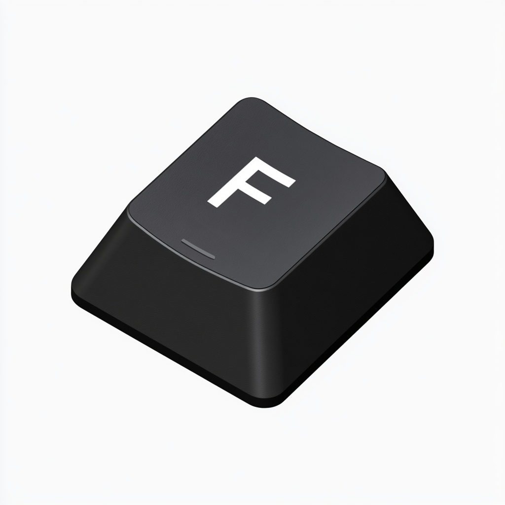
Keyboard F key with raised tactile bar
Key Switch
Keyboard Key with Tactile Homing
Computer keyboards, data entry terminals, point-of-sale systems, musical instrument controllers
A keycap with a raised bar or dot on the F and J keys (and 5 on the numpad) that lets the typist find home row by touch alone. The bar is a mechanical indicator embedded in an input device. The fingers locate their starting position without the eyes ever leaving the screen. Ten keys under ten fingers, each distinguished by position, with two tactile landmarks anchoring the spatial map.
Delight
A
Error Resistance
A
Fault Tolerance
A
Legibility
B
Appropriateness
A
A
Tactile homing without looking. The raised bar is a zero-cost calm landmark.
Cost and Supply Chain
$ Membrane keyboard
  • Rubber dome membrane keyboards: $5 to $20 retail. The raised bar on F and J is molded into the keycap at zero additional cost. Mushy feel, but the homing bar still works.
  • Cost driver: the switch mechanism under the cap. Membrane dome sheets are the cheapest possible keyboard switch. The calm property (homing bar) is independent of the switch quality.
$$ Mechanical switch keyboard
  • Cherry MX, Kailh, Gateron switches: $0.25 to $0.80/switch. Defined actuation point, spring return, audible or tactile click depending on variant. The keycap + switch combination is the full interaction.
  • Cherry MX Blue (click + tactile), MX Brown (tactile, no click), MX Red (linear, no tactile bump). Each encodes a different relationship between force, feedback, and sound.
$$$ Premium mechanical
  • Topre electrostatic capacitive: $1.50 to $3.00/switch. Rubber dome + spring + capacitive sensing. Smooth, weighted feel. Used in Happy Hacking Keyboard and Realforce.
  • Custom artisan keycaps in PBT or POM with sculpted profiles (SA, MT3, Cherry). $30 to $150 per set. The cap shape, material, and texture become the primary tactile interface.
Calm With Cheap Parts
  • The raised homing bar is the single calmest feature on any keyboard and it costs nothing. It is a sub-millimeter ridge molded into two keycaps. It allows the user to reposition all ten fingers without looking. Every keyboard has it, including the cheapest ones.
  • Key spacing (19.05mm standard pitch) is a calm property: it matches average adult finger width so adjacent keys are distinguishable by proprioception. Deviating from standard pitch to shrink a keyboard makes every key harder to find by touch.
  • Sculpted keycap profiles (each row a different height and angle) help fingers locate their row by feel. Even budget keyboards with sculpted caps get this benefit. Flat, uniform-profile caps lose it.
  • If you have +$0.20/switch to spend: upgrade from rubber dome to a mechanical switch with a tactile bump (Kailh Box Brown, Gateron Brown). The bump confirms actuation without requiring the key to bottom out, reducing finger fatigue and typing noise.
  • Key legends printed on the front face of the cap (rather than the top) last longer because fingers don't wear them away. Doubleshot or dye-sublimated legends are permanent. Both are calm because they maintain legibility over the life of the keyboard.
Failure Modes
  • No homing bars. Some low-end or novelty keyboards omit them. Touch typing becomes impossible without visual reorientation.
  • Flat keycaps with no sculpting. Every row feels the same. The finger can't tell if it's on Q or A without looking.
  • Mushy bottoming-out with no tactile actuation point. The finger pushes until it hits the plate. No signal for "input received" except the character appearing on screen.
  • Key wobble: the cap rocks laterally on the stem. The finger feels instability instead of precision. Common on cheap mechanical switches with loose tolerances.
  • Inconsistent spring weight across the keyboard. If the spacebar is heavier than letter keys (common), the thumbs fatigue faster. If modifiers are lighter, accidental activation increases.
Real-World Examples
  • $ Cherry MX Brown (MX1A-G1NN)
    Tactile, non-clicky mechanical switch. 45cN actuation, 2mm travel to actuation point. The benchmark "office" switch. ~$0.40/switch.
    Mouser (Cherry switches)
  • $$ Kailh Box Brown
    IP56 dust/water resistant tactile switch. Box stem design reduces wobble. ~$0.35/switch at volume.
    DigiKey (keylock switches)
  • $$$ Topre 45g electrostatic capacitive
    Rubber dome + conical spring + capacitive PCB. Smooth press with no scratch. Used in HHKB Professional and Realforce R3. ~$2.00/switch equivalent (sold in assembled keyboards).
    HHKB
Why this is calm: A keyboard is an array of identical buttons distinguished only by position. The raised homing bar solves the fundamental problem: how do you find your place in a grid of 100+ identical switches without looking? The answer is a sub-millimeter ridge on two keys. From those two landmarks, the typist's spatial memory maps every other key by relative position. The fingers know where they are. The eyes stay on the screen or the document. Touch typing is peripheral input at its most developed: the motor system operates the keyboard while conscious attention stays on the content. The raised bar is what makes that possible, and it costs nothing to manufacture.

Rotary Controls

2 patterns

Rotary controls encode value in angle. A pointer on a dial, a detent on an encoder, a knob position on a stove. The hand wraps, the wrist turns, and the system responds proportionally. Rotational inputs build spatial memory: the user remembers where the knob was, not what number was on a screen.


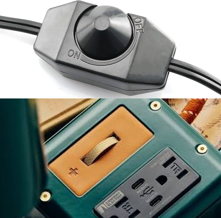
Rotary Dimmer Switch with On / Off capacity
Rotary
Rotary Dial with Detents
Consumer audio, home climate controls, stove knobs, thermostat
Stepped or continuous. The pointer position maps to a value on a visible scale. Each detent is a tactile waypoint. The user builds a proprioceptive map of the range: "three clicks from the left is medium heat." The knob position is readable from the periphery.
Delight
B
Error Resistance
A
Fault Tolerance
B
Legibility
A
Appropriateness
A
B+
High legibility and error resistance. Delight depends on weight and detent quality.
Cost and Supply Chain
$ Plastic knob + pot
  • Generic rotary pot + plastic cap: $0.30 to $0.80/unit. Loose feel, no weight. Functional.
  • Cost driver: the knob cap (metal vs. plastic) accounts for most of the perceived quality difference.
$$ Encoder with detents
  • Alps Alpine EC11, Bourns PEC series: $1.00 to $4.00/unit. Defined detent positions, digital output, push-to-select.
$$$ Weighted haptic encoder
  • Grayhill 62N Premium Haptic, NKK rotaries: $15 to $45/unit. Tunable detent torque profile. Metal knob with mass. The buttery dial.
Calm With Cheap Parts
  • A cheap pot with clear printed end-stops and scale markers is calmer than an expensive encoder with no markings. Legibility first, feel second.
  • Use firmware to smooth input jitter and debounce on cheap encoders. A jittery reading makes the whole device feel broken.
  • Provide a subtle visual or LED change at key positions (min, max, center detent). This costs firmware time, not hardware dollars.
  • If you have +$0.50: add a slightly heavier knob cap. A zinc alloy insert inside a plastic shell dramatically improves perceived quality.
  • Pointer line on the knob is critical. Without it, the knob position is unreadable. A contrasting paint fill in a molded groove costs near zero.
Failure Modes
  • No end-stops on a bounded range. User over-rotates past max and gets lost.
  • No pointer line on knob. Direction and position are invisible.
  • Non-linear response curve without visual cue (first 90 degrees does nothing, last 10 degrees covers the whole range).
  • Cheap pot with "dead zone" near the end of travel where the value doesn't change.
Real-World Examples
  • $ Bourns PEC11R-4215F-S0024
    24-pulse mechanical encoder with push switch. 15mm shaft, vertical mount. Clean detents. ~$2.20/unit.
    DigiKey
  • $$ Alps Alpine EC11E15244B2
    15-pulse incremental encoder, metal shaft. Defined detent positions, reliable step count. ~$5.00/unit.
    DigiKey
  • $$ Alps Alpine EC11E18244A5
    18-pulse variant, same family. Metal shaft, vertical mount. ~$5.38/unit.
    DigiKey
  • $$$ Grayhill 62A-D-V Premium Haptic Encoder
    Optical, 1M+ cycle life. Tunable torque profiles, 12 to 32 detent options. Optional push switch. The reference encoder.
    Grayhill optical encoders Mouser
Why this is calm: End-stops and detents create a bounded, predictable range. The user cannot "get lost" because the physical limits of rotation match the value limits of the system. Spatial memory develops quickly: three clicks clockwise is medium, full clockwise is max. This works without looking, without a screen, and continues working when the power is off.
your image here
Scroll
Scroll Wheel / Infinite Encoder
Mice, media controllers, synth parameter control, menu navigation
An unbounded rotary input. Unlike a dial with end-stops, the scroll wheel keeps going. Each detent is a discrete step through a list or value range. The lack of physical limits means the system must provide its own feedback about position and bounds.
Delight
B
Error Resistance
C
Fault Tolerance
B
Legibility
D
Appropriateness
B
B-
Powerful but low legibility. No physical position cue. Relies on screen feedback.
Cost and Supply Chain
$ Generic encoder
  • Generic incremental encoder: $0.30 to $0.80/unit. Inconsistent detent feel, occasional missed steps.
$$ Quality incremental encoder
  • Alps Alpine EC series, Bourns PEC: $1.50 to $5.00/unit. Clean detents, reliable step count, push-to-select.
$$$ Optical / haptic encoder
  • Grayhill optical encoders, 68A machine encoders: $12 to $35/unit. High resolution, tunable detent profiles, sealed.
Calm With Cheap Parts
  • An infinite encoder with no feedback is not calm. Pair even a cheap encoder with a ring LED or a small display showing current value.
  • Implement acceleration in firmware: slow rotation = fine adjustment, fast rotation = coarse jumps. This makes a 24-detent encoder feel like it has 200 steps of resolution.
  • Add an audible or haptic "bump" at boundary values (0%, 100%, saved preset). The user needs to know when they've hit the end of a range that has no physical end.
  • If you have +$1.00 to spend: pair the encoder with a ring of discrete LEDs around the knob. Position is now visible again.
Failure Modes
  • No feedback at range boundaries. User scrolls past max with no indication.
  • Missed steps from cheap encoder bouncing. Value jumps erratically.
  • No acceleration curve: scrolling through a list of 200 items at one-step-per-detent.
Real-World Examples
  • $ Bourns PEC11R-4020F-N0024
    24-pulse mechanical encoder, no push switch. Budget option for scroll/select interfaces. ~$1.89/unit.
    DigiKey (PEC11R family)
  • $$ Alps Alpine EC11E09244BS
    9-pulse incremental encoder, compact. Fewer detents per revolution = faster scrolling through long lists. ~$4.89/unit.
    DigiKey
  • $$$ Grayhill 62AG Value Optical Encoder
    16 or 32 detents, 1M cycle optical. Patented low-BOM design makes it price-competitive with mechanical at volume.
    DigiKey (62AG overview)
  • $$$ Grayhill Touch Encoder
    320x300 display + optical encoder + tap/swipe gestures. IP67. Replaces multiple controls with one device. USB/CAN J1939.
    Mouser DigiKey
Why this is calm (when done right): The infinite encoder is a compact, single-finger input for navigating complex parameter spaces. It becomes calm only when paired with adequate feedback. The detent is the encoder's promise: "I received one step of input." The system's job is to show what that step changed. Without that feedback loop, the encoder is just a wheel spinning in the void.

Doors

7 patterns

Doors, panels, and enclosures communicate their operation through shape. A flat plate says push. A vertical bar says pull. A lever handle says press down. A quarter-turn fastener says twist to release. The best ones need no instruction because their affordance is the interface.


your image here
Push Plate
Flat Plate, No Handle
Commercial buildings, hospitals, kitchens, one-way traffic doors
A metal plate with no grip tells you to push. The absence of a handle is itself the instruction. This is the clearest affordance in architecture: no handle means no pull, no twist, no slide. Just push.
Delight
C
Error Resistance
A
Fault Tolerance
A
Legibility
A
Appropriateness
A
A-
Perfect legibility. Low delight potential (it's a plate).
Cost and Supply Chain
$ Stainless steel plate
  • Commercial push plate: $8 to $20. Standard hardware catalog item.
$$$ Custom material
  • Brass, bronze, or custom-milled plate: $40 to $200+. The material itself becomes the delight layer.
Calm With Cheap Parts
  • Even the cheapest push plate is calm if placed correctly. No label needed. The plate IS the instruction.
  • Material warmth (brass, copper) adds peripheral comfort. But a $10 stainless plate does the same job for legibility.
  • The calm failure is on the other side: putting a pull handle on a push door. The push plate's job is to prevent that error entirely.
Failure Modes
  • Push plate on a door that also needs to be pulled (two-way swing with handles on both sides).
  • Push plate mounted at wrong height. Too high to push with a hip or elbow.
  • "Push" sign added on top of a push plate. The sign is admitting the plate failed.
Real-World Examples
  • $ Don-Jo 71-630
    Stainless steel push plate, 4" x 16". Standard commercial grade. ~$12 to $18.
    Amazon
  • $$ Rockwood 70C push plate
    Brass or bronze push plate, 4" x 16". Warm material feel, patinas over time. ~$25 to $60.
    Amazon
  • $$$ Custom fabrication
    Architectural metalworkers can mill push plates in any material, finish, and dimension. $100+.
Why this is calm: The push plate eliminates an entire category of error (pulling a push door) by removing the affordance for the wrong action. It teaches through absence. Norman's classic door problem is solved not by better labeling but by removing the handle entirely.
your image here
Lever
Lever Handle
Residential, commercial, ADA-compliant installations
Accessible by design. Operable with an elbow, a wrist, or a closed fist. The lever shape communicates "press down" through its geometry. ADA compliance made universal.
Delight
B
Error Resistance
B
Fault Tolerance
A
Legibility
A
Appropriateness
A
A-
The accessibility benchmark. Operable without grip strength.
Cost and Supply Chain
$ Commercial lever
  • Standard commercial lever set: $15 to $40. Hollow construction, adequate action.
$$ Solid residential lever
  • Schlage, Kwikset mid-range: $40 to $100. Solid feel, consistent spring return.
$$$ Architectural hardware
  • FSB, Valli&Valli, custom: $100 to $500+. Machined stainless or brass. The handle is furniture.
Calm With Cheap Parts
  • Even the cheapest lever handle meets ADA requirements for operability without gripping or twisting. The shape does the work.
  • Spring return is essential. A lever that stays depressed after release confuses the user about door latch state.
  • Lever pointing downward when at rest signals "ready." Lever horizontal signals "engaged." This costs nothing in hardware.
Failure Modes
  • Lever that catches on clothing or bags when passing (too protruding, wrong height).
  • Weak spring return: lever stays down and user can't tell if the door is actually latched.
  • Lever shape too similar to a pull handle. Confuses push/pull expectation.
Why this is calm: The lever handle encodes its operation in its geometry. Press down to open. The same motion works for a full hand, a wrist, an elbow, or a closed fist. Accessibility and calm design converge here: the interface that works for the widest range of bodies is also the interface that requires the least cognitive attention.
your image here
Automatic
Sensor-Activated Entry
Grocery stores, airports, hospitals, public transit
No handle at all. Presence is the input. The door moves to the periphery of attention entirely. You don't operate it; it operates for you. The interaction is walking.
Delight
C
Error Resistance
B
Fault Tolerance
D
Legibility
C
Appropriateness
A
B-
Excellent when working. No fallback when the sensor fails.
Calm With Cheap Parts
  • The calm gap is the failure mode: when the sensor fails, you're locked out with no handle to grab. Always include a manual override (push bar, panic bar) visible from the approach.
  • Sensor zone should be clearly marked or implied by floor pattern. "Will this door open for me?" is anxiety, not calm.
Failure Modes
  • Sensor doesn't trigger. User stands in front of a closed door with no way to open it.
  • Door opens for passing traffic when you're standing near it. False activation wastes energy and startles.
  • No indication of whether the door is automatic. User pushes a door that's about to open on its own.
  • Power outage: no manual override means the door becomes a wall.
Why this is calm (conditionally): When working, the sensor-activated door is the ultimate peripheral interaction: the door removes itself from your attention entirely. But it is calm only because of its reliability. The moment it fails, it becomes the opposite of calm: an obstacle with no visible controls. The calm version always has a manual fallback.
your image here
Sliding
Barn Door Track
Residential, office partitions, bathroom dividers
A recessed grip and visible rail signal lateral motion. The track itself teaches the interaction. You can see from across the room whether the door is open, closed, or halfway. The rail is the display.
Delight
A
Error Resistance
A
Fault Tolerance
A
Legibility
A
Appropriateness
B
A
Self-teaching. The track is the affordance, the readout, and the guide.
Calm With Cheap Parts
  • The visible track is the calm feature, and it's structural, not a premium add-on. Even budget barn door kits expose the rail.
  • A soft-close mechanism ($5 to $15 add-on) prevents slamming and signals quality. This is a high-value calm upgrade.
  • The grip should be flush or recessed so the door doesn't snag on passersby. A simple routed groove in the wood costs less than attached hardware.
Failure Modes
  • No soft-close: the door slams. Startling. Damages the wall and the door over time.
  • Track too short: door doesn't clear the opening fully. The gap is ambiguous.
  • No floor guide: door swings laterally and hits the wall at an angle.
Why this is calm: The barn door track is a system where every component teaches the interaction. The rail says "I slide." The grip says "grab here." The position on the rail says "I'm 60% open." No labels, no instructions, no electronics. The mechanism is the interface.
your image here
Foot-Operated
Foot Pull
Restroom doors, hospital corridors, commercial kitchens, cleanroom entries, any high-traffic door where hands are occupied or hygiene matters
A metal step-plate or hook mounted at the base of a pull door, operated by hooking a foot under it and pulling the door open. The hands never touch the door. Emerged widely during the COVID-19 pandemic but the design problem is older: anyone carrying a tray, pushing a cart, wearing gloves, or working in a sterile environment has always needed a way to open a door without hands. The foot pull solves it with a piece of bent steel.
Delight
C
Error Resistance
A
Fault Tolerance
A
Legibility
B
Appropriateness
A
A-
Hands-free door operation. A calm solution to a hygiene and accessibility problem.
Cost and Supply Chain
$ Stamped steel foot pull
  • StepNpull or generic: $15 to $25. Stamped steel, powder-coated, mounts with three screws to the bottom of any pull door. Retrofit in five minutes.
  • Cost driver: effectively none. The part is a bent piece of sheet metal. The cost is almost entirely in the mounting hardware and finish.
$$ Stainless or branded
  • Stainless steel or brass finish models: $25 to $50. Better corrosion resistance, matches commercial door hardware aesthetics.
$$$ Custom integrated
  • Architect-specified foot pulls built into the door frame or kickplate: $50 to $150+. Flush-mounted, continuous with the door surface. The pull disappears into the architecture.
Calm With Cheap Parts
  • A $15 stamped steel foot pull does 100% of the job. There is no functional difference between the cheap and expensive versions. The calm property is hands-free operation, and a piece of bent metal achieves it completely.
  • Mounting height matters: the hook should clear the floor by about 3 to 4 inches, low enough to slide a foot under without lifting the leg, high enough to clear a shoe toe comfortably.
  • A small "hands-free" or pictogram label above the foot pull helps first-time users notice it. The device is low and outside the normal visual scan zone for door hardware. Once noticed, it's immediately obvious.
  • The foot pull pairs with a push plate on the other side: push to enter (no touch needed), foot-pull to exit (no touch needed). The entire door interaction becomes hands-free in both directions.
Failure Modes
  • Mounted on a heavy door with a strong closer. The foot can open the door a crack, but not wide enough to walk through. The door needs a lighter closer spring or the foot pull isn't viable.
  • Too close to the floor. The user's toe catches under it while walking past. The foot pull becomes a trip hazard instead of an aid.
  • No signage. Users don't look at the bottom of doors. Without a label or pictogram at eye height pointing down to it, most people never notice the foot pull exists.
  • Installed on a push door. A foot pull on a push door is a Norman door in reverse: the affordance says pull, but the door needs to be pushed.
Real-World Examples
  • $ StepNpull hands-free door opener
    The original foot-operated door pull. Stamped steel, powder-coated black or silver. Three-screw mount. ~$20.
    StepNpull
  • $$ Toekick by Trimco
    Commercial-grade stainless steel foot pull. ADA-friendly. Designed for high-traffic institutional doors. ~$30 to $50.
    Trimco
Why this is calm: The foot pull moves door operation to an idle channel. Your hands are carrying a tray, pushing a cart, holding a child, or simply staying clean. The foot is available and doing nothing. The foot pull puts it to work without adding cognitive load. This is the same principle as the sewing treadle and the dental pedal: when the primary channel (hands) is occupied, route the interaction to a secondary channel (feet). The foot pull is the door equivalent of a foot pedal, and it costs $15.
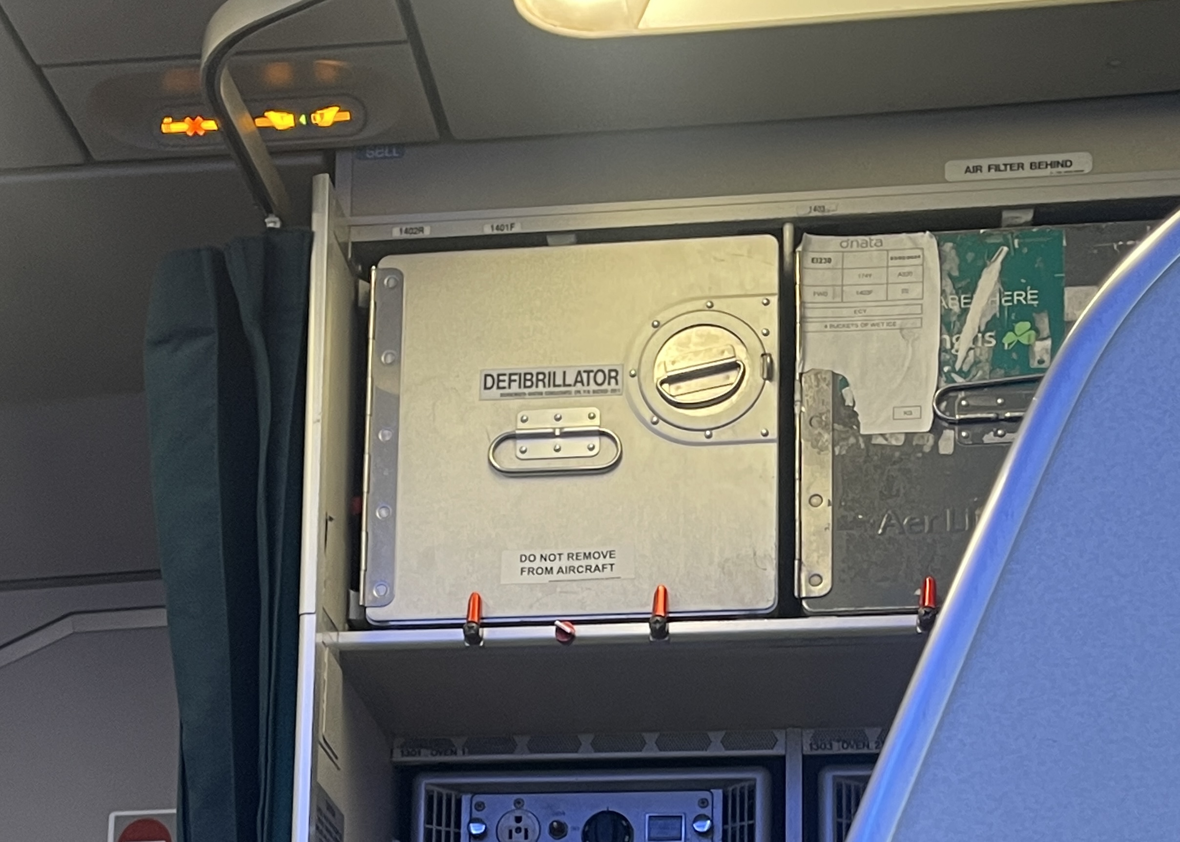
Quarter-turn fasteners and retention clips on aircraft galley equipment
Retention
Directional Retention Clip
Aircraft galleys and equipment bays, server rack panels, industrial enclosures, marine hatches, medical device housings, avionics
A fastener whose handle position shows locked or unlocked state. Quarter-turn fasteners (Dzus, Camloc) use a 90-degree rotation between locked and released. The slot in the head points one direction when locked, perpendicular when unlocked. Spring clips and over-center latches use displacement: clipped down means secured, flipped up means released. In all cases, the physical position of the fastener is the readout. You can scan a row of fasteners and see at a glance which ones are secured and which are not. Aircraft galleys use this extensively: the red-handled quarter-turn fasteners on galley carts, the orange spring clips on defibrillator cases, and the recessed latches on lavatory panels all show their state through position and color.
Delight
B
Error Resistance
A
Fault Tolerance
A
Legibility
A
Appropriateness
A
A
Position is state. Scannable at a glance across a row of fasteners.
Cost and Supply Chain
$ Spring clip / bail latch
  • Over-center spring clips (toggle latches, bail clamps): $0.50 to $3.00/unit. Stamped steel, zinc-plated. The simplest retention mechanism: flip up to release, push down to lock. Position is the readout.
$$ Quarter-turn fastener
  • Southco, Camloc quarter-turn: $2 to $8/unit. Stud + receptacle. 90-degree turn locks or releases. The slot in the head shows orientation. Standard in aerospace, telecom, and industrial panels.
  • Cost driver: material (steel vs. stainless vs. titanium) and environmental rating (vibration, salt spray). The mechanism itself is simple.
$$$ Dzus aerospace fastener
  • Dzus (now Southco) aerospace-rated quarter-turn: $5 to $20/unit. Certified to aerospace vibration and load specs. Self-ejecting stud, captive design so the fastener cannot be lost. The standard in commercial aviation.
Calm With Cheap Parts
  • The calm property is directional legibility: the fastener's orientation or position tells you its state. A $0.50 spring clip achieves this as well as a $15 Dzus fastener. Down = locked. Up = released. No ambiguity.
  • Color coding amplifies legibility at zero mechanism cost. Aircraft galleys use red handles on safety-critical fasteners: the red is visible in peripheral vision and marks "this is the one you operate." A dab of red paint or a red plastic cap on a generic toggle latch achieves the same effect.
  • Consistent orientation convention across a panel is essential. If all fasteners on a panel lock at the same angle, a single glance confirms the entire panel is secured. Mixed orientations force per-fastener inspection.
  • Captive design (the fastener cannot separate from the panel when released) prevents lost hardware. In aviation this is a safety requirement; in consumer products it prevents the user from losing a screw or clip and being unable to close the panel. A tethered cap or a self-ejecting stud that stays in the hole both achieve this.
Failure Modes
  • No directional indicator. A round knob that twists but shows no orientation means the user cannot tell if it's locked without pulling on the panel. The slot or line on the fastener head is the critical feature.
  • Inconsistent locking direction across the same product. Some fasteners lock clockwise, others counter-clockwise. The user must check each one individually.
  • Non-captive fastener. The screw or clip comes fully out when released. It gets dropped, lost, or forgotten. Reassembly now requires finding the missing part.
  • Spring tension too high. The user needs a tool or excessive force to release a clip designed for tool-free access. Defeats the purpose of a quick-release mechanism.
  • Fastener flush with the panel surface. No tactile or visual affordance for "grab here." The user doesn't know the panel is removable.
Real-World Examples
  • $ Southco 94 series toggle latch
    Over-center draw latch, steel or stainless. Pull to release, push to lock. Position shows state. From ~$2.50/unit.
    Southco draw latches
  • $$ Southco DZUS quarter-turn
    Quarter-turn panel fastener, slotted head. 90-degree turn to lock/release. Self-ejecting, captive stud options. The aerospace and telecom standard.
    Southco quarter-turn fasteners
  • $$ Camloc 2600/2700 series
    Quarter-turn fastener for cowlings and access panels. Spring-loaded, flush or protruding. Used on aircraft engine cowlings and avionics bays.
    Camloc
Why this is calm: A row of retention fasteners is a peripheral status display. Each fastener shows its own state through position and color. A crew member walking past an aircraft galley can scan twenty fasteners in two seconds and confirm that every cart, every panel, every defibrillator case is secured. No checklist app, no sensor, no screen. The physical position of each handle IS the status indicator. This is the same principle as the toggle switch (position = state) applied to panel retention. The calmest version uses consistent orientation, color-coded handles, and captive hardware so nothing can be lost, missed, or misread.
your image here
Access Control
Push-to-Exit Button
Office buildings, hospitals, schools, warehouses, server rooms, any door secured by electronic lock or magnetic lock
A large, clearly labeled button mounted on or beside a secured door that releases the electronic lock when pressed. The button is typically oversized (mushroom cap or large square), stainless steel, with "PUSH TO EXIT" text or a green LED. It solves a specific problem: how do you get out of a room whose door is locked electronically? The answer is the most obvious possible interaction. A big button that says what it does.
Delight
C
Error Resistance
A
Fault Tolerance
B
Legibility
A
Appropriateness
A
A-
Big, labeled, obvious. The button says what it does. No card, no code, no ambiguity.
Cost and Supply Chain
$ Basic push-to-exit
  • Generic stainless steel push-to-exit button with NO/COM contacts: $5 to $15. Mounts in a standard single-gang electrical box. Momentary contact releases the magnetic lock or electric strike.
  • Cost driver: the button itself is trivially cheap. The cost is in the access control system it connects to (controller, power supply, lock, wiring).
$$ Illuminated / vandal-resistant
  • UHPPOTE, Visionis, Seco-Larm illuminated models: $10 to $30. Green LED backlight, IP65 rated, stainless steel faceplate. The LED confirms "this button is active." Vandal-resistant housing for public spaces.
$$$ No-touch / infrared exit sensor
  • Infrared no-touch exit buttons: $25 to $60. Wave a hand near the sensor to trigger release. No physical contact required. Used in healthcare, cleanrooms, and post-pandemic hygiene-conscious installations. Combines the function of a push-to-exit with the hands-free benefit of a sensor-activated door.
Calm With Cheap Parts
  • The calm property is text labeling on the button or faceplate. "PUSH TO EXIT" eliminates all ambiguity. A person who has never been in the building before, in a moment of urgency, needs to be able to exit. The button must be findable, readable, and operable on the first attempt.
  • Size matters. A large mushroom-cap button (40mm+ diameter) is findable in peripheral vision and operable with a palm, elbow, or gloved hand. A small flush button fails the urgency test.
  • Green LED or green faceplate color codes "go" and "exit" by convention. This is free if the button ships with a green LED (most do). It adds a peripheral signal that says "this is how you get out" before the user reads the text.
  • Mounting height: ADA specifies 34 to 48 inches from floor. Mounting at the right height costs nothing and determines whether wheelchair users can reach it.
  • Fail-safe wiring: in a power outage, the door must unlock. The push-to-exit button is a convenience; the fire code is the law. The calm version of this system degrades gracefully: no power = door opens = everyone can exit.
Failure Modes
  • No button visible. The door is magnetically locked but there is no obvious way to exit. The user pushes, pulls, and rattles the door before noticing a small unmarked switch on the wall three feet away.
  • Button too small or flush-mounted. In a fire or emergency, fine motor control degrades. A recessed button that requires a fingertip press fails when people are panicking.
  • No text label. A blank stainless steel button on a wall could be a light switch, a doorbell, or an exit release. Without "PUSH TO EXIT," the user has to guess.
  • Fail-secure wiring without override. If power is lost and the door stays locked, the push-to-exit button is useless and people are trapped. This is a fire code violation, not just a calm tech failure.
  • Button placed on the wrong side of the door, or too far from the door to associate with it. Proximity is the affordance: the button must be within arm's reach of the door it controls.
Real-World Examples
  • $ UHPPOTE Momentary Push-to-Exit
    Stainless steel panel, NO/COM output. The standard budget REX button for access control. ~$6 to $10.
    Amazon
  • $$ Visionis VIS-7001 illuminated
    IP65 weatherproof, green LED, stainless steel. NO/NC/COM outputs. Indoor and outdoor rated. ~$12 to $18.
    FPC Security
  • $$$ Seco-Larm no-touch infrared exit sensor
    Infrared proximity sensor, wave-to-exit. No physical contact. Adjustable sensitivity and timer delay. ~$30 to $55.
    JMAC Supply (REX buttons)
Why this is calm: The push-to-exit button solves the anxiety of being in a locked room. Electronic access control creates a new problem that didn't exist with mechanical locks: the door is locked and you can't see how to open it. The push-to-exit button answers that anxiety with the most legible possible interface: a large, labeled button that says exactly what it does. Press it. The door opens. No card, no code, no app, no ambiguity. In a building full of access-controlled doors, the consistency of the push-to-exit convention means the user learns it once and trusts it everywhere. That trust is calm.

Foot Pedals

3 patterns

Foot pedals free the hands for other work. A sewing machine treadle, a car accelerator, a sustain pedal. The foot provides proportional force control while the eyes and hands stay on the primary task. This is peripheral interaction at its most literal.


your image here
Proportional
Sewing Machine Treadle
Sewing machines, industrial textile equipment
Continuous speed control through ankle pressure. Hands stay on the fabric. Eyes stay on the needle. The foot manages velocity without conscious attention once learned. One of the oldest examples of a peripheral, proportional input device.
Delight
B
Error Resistance
B
Fault Tolerance
A
Legibility
B
Appropriateness
A
B+
Peripheral control at its purest. Hands never leave the work.
Calm With Cheap Parts
  • The response curve is everything. A linear mapping from pedal pressure to motor speed is the minimum viable version. Cheap rheostats can do this.
  • The pedal surface should have enough friction and size that the foot doesn't slip. A textured rubber pad ($0.50) is the highest-value upgrade.
  • Spring return force should match the weight of a relaxed foot. Too stiff = fatigue. Too loose = accidental activation.
Failure Modes
  • Non-linear response: light pressure = full speed. The foot startles and jerks away.
  • Pedal slides on the floor. The user has to look down to reposition it. Attention leaves the work.
  • No dead zone at the bottom of travel. Any contact = movement. No safe rest position for the foot.
Why this is calm: The treadle allows the user's conscious attention to stay on the primary task (guiding fabric, watching the needle) while a secondary channel (the foot) manages speed. The input becomes automatic, proprioceptive, and peripheral within hours of learning. Calm technology at its most literal: the control fades from awareness while continuing to function.
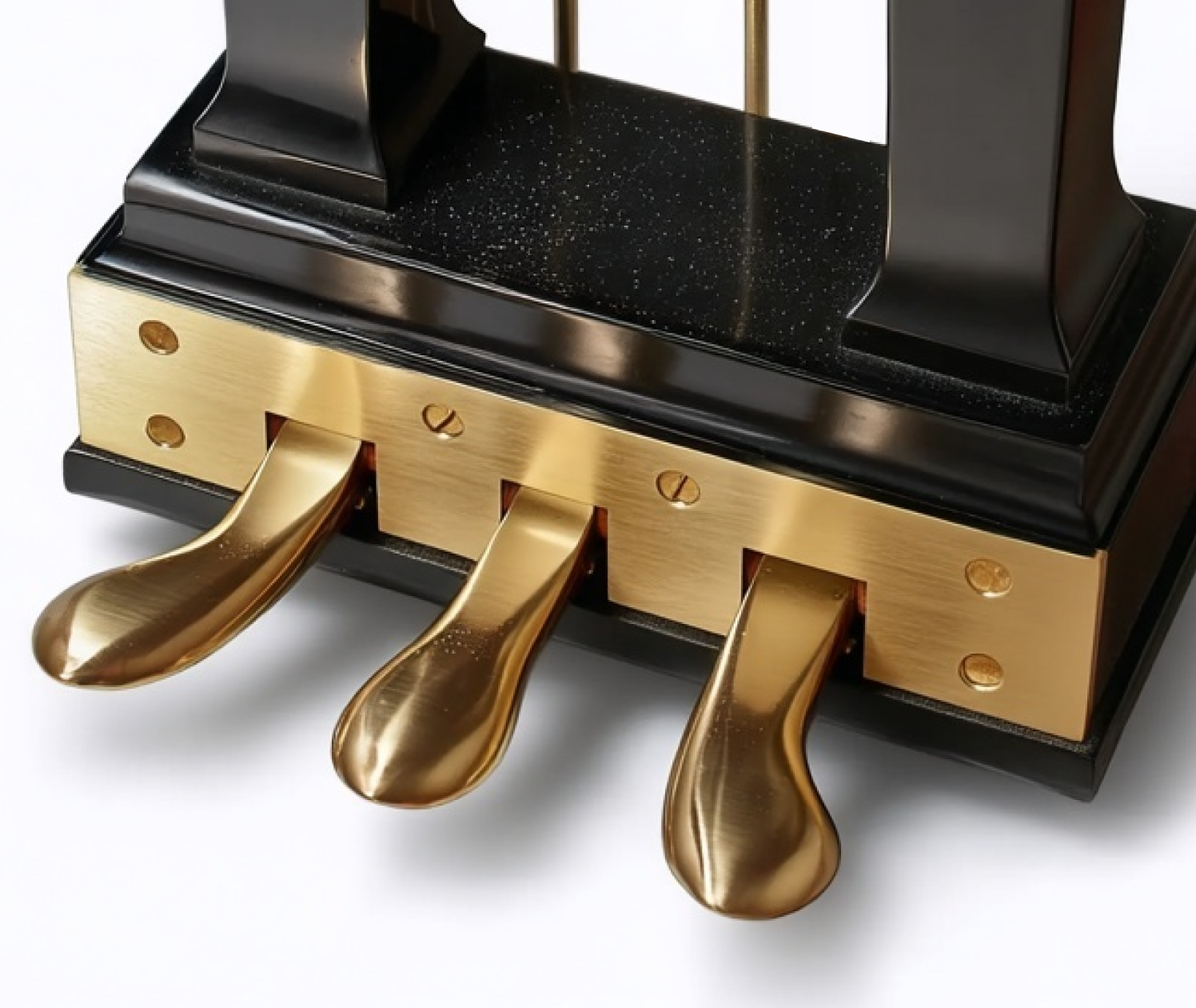
Sustain Pedal
Binary
Sustain Pedal (Piano)
Pianos, keyboards, synthesizers, organ expression
Press to hold, release to dampen. A binary input that transforms the instrument's entire tonal character. Pianists operate it reflexively, their attention fully on the keys and the score.
Delight
A
Error Resistance
A
Fault Tolerance
A
Legibility
B
Appropriateness
A
A
Binary clarity. Down = sustain. Up = dampen. No ambiguity.
Calm With Cheap Parts
  • Weight is the key variable. A plastic sustain pedal slides across the floor under repeated use. A $2 rubber pad on the bottom solves this.
  • The spring resistance should be heavy enough that resting a foot on the pedal doesn't trigger it. This is the dead zone that prevents accidental input.
  • Polarity detection: some keyboards invert sustain polarity depending on whether the pedal is pressed at power-on. A momentary calibration routine at startup prevents this confusion at zero hardware cost.
Failure Modes
  • Pedal slides on hard floor. Performer chases it with their foot mid-performance.
  • Inverted polarity: pressing the pedal cuts sustain instead of adding it. The opposite of the expected behavior.
  • Cheap pedal with mushy threshold: half-press doesn't clearly activate or deactivate. The binary nature is lost.
Why this is calm: The sustain pedal is binary, peripheral, and habitual. It operates below the threshold of conscious attention for an experienced player. The simplicity of the mapping (down = on, up = off) means there is nothing to learn, nothing to remember, nothing to decode. The foot knows.
your image here
Binary
Dentist's Chair Pedal
Dental operatories, surgical suites, tattoo studios
Activates the drill or water line. Both of the dentist's hands stay in the patient's mouth. A foot pedal is the only viable input when your hands are occupied and sterile. Clinical necessity drove the design. The calm pattern here is not aesthetic; it is functional: the foot operates the tool so the hands never leave the work.
Delight
C
Error Resistance
A
Fault Tolerance
A
Legibility
B
Appropriateness
A
A-
Necessity-driven calm. Hands can't leave the work.
Calm With Cheap Parts
  • The design lesson is channel separation: when hands are primary, feet are secondary. This applies to any device where the user's hands are occupied.
  • A simple momentary foot switch ($5 to $15) can add foot-activated control to any workstation tool. The switch itself doesn't need to be medical grade to provide the calm benefit.
  • Anti-slip base and deliberate actuation force prevent accidental activation, which in a medical context is a safety issue.
Failure Modes
  • Accidental activation while repositioning feet. In a dental context, this means an unexpected drill start.
  • Pedal positioned too far from the seated operator. Reaching for it shifts posture and destabilizes hand work.
  • No tactile differentiation between multiple pedals (drill vs. water vs. suction). The foot can't tell them apart without looking.
Why this is calm: The dental foot pedal solves a constraint problem: the hands cannot leave the work, so control must move to another channel. This is the calm tech principle of using the right channel for the right input. The foot is already idle; the pedal puts it to work without adding cognitive load. The user's primary attention stays on the patient, not the tool activation.

Output Indicators

4 patterns

Inputs are only half the interaction. The system must also communicate back: is it on, is it ready, what state is it in, how much is left? The calmest output indicators are readable from the periphery without demanding focused attention. A diffused LED glow, a needle position on a gauge, a shrinking colored disc, a mechanical flag. The output is the system's side of the conversation.


your image here
Status Light
Diffused Status Light
Appliances, network equipment, smart home devices, chargers, power tools
A small LED, usually diffused through a translucent housing or light pipe, that communicates system state through color, brightness, or pulse pattern. When done well, it answers "is this thing on?" from across the room without demanding a glance at a screen. When done poorly, it blinks cryptically in patterns that require a manual to decode.
Delight
C
Error Resistance
B
Fault Tolerance
B
Legibility
B
Appropriateness
A
B
Peripheral by nature. Legibility depends on how many states are encoded.
Cost and Supply Chain
$ Single-color LED
  • Standard 3mm or 5mm through-hole LED: $0.05 to $0.25/unit. One color, on or off. The simplest possible status indicator.
  • Diffused lens vs. water-clear: diffused spreads the glow and softens it. Costs the same. Always pick diffused for status indication.
$$ Panel-mount indicator
  • Dialight 559 series panel mount: $1.30 to $3.00/unit. Pre-assembled with bezel, wired leads. Drop into a 6.35mm panel cutout.
$$$ Addressable RGB
  • Adafruit NeoPixel (WS2812B): $1.50 to $2.00/unit. Full 24-bit color from a single data pin. Can communicate many states with color, but complexity is the risk.
Calm With Cheap Parts
  • One color, two states (on/off) is the calmest possible indicator. Green = running. Off = not running. That's it. Resist the urge to add blink patterns.
  • Brightness matters. A status LED should be visible in ambient light but not blinding in a dark room. A current-limiting resistor choice of 1K to 4.7K ohm (instead of the usual 330 ohm) dims the LED to a comfortable glow at zero cost.
  • A light pipe or frosted lens cap ($0.05) turns a point source into a soft glow. The diffusion itself is the calm improvement.
  • If you must encode more than two states, use no more than three: off, steady on, slow pulse. Fast blink and color-coded patterns require a manual and are an anti-pattern.
Failure Modes
  • Blink codes: 3 fast blinks = error type A, 5 fast blinks = error type B. Requires a manual and a stopwatch. Not peripheral, not calm.
  • LED too bright. A blue or white LED at full current in a bedroom device is a light pollution source, not a status indicator.
  • LED hidden or recessed so deeply it's invisible from normal viewing angles.
  • Color-only encoding without brightness or pattern for colorblind users (8% of men). Red vs. green is invisible to protanopes.
Real-World Examples
  • $ Kingbright WP7113GD (green diffused 5mm)
    Standard diffused green LED, T-1 3/4 package. The default status indicator. ~$0.10/unit.
    DigiKey (5mm LEDs)
  • $$ Dialight 559 series panel indicator
    5mm diffused LED with panel-mount bezel, available in red, green, yellow. Wire leads. ~$1.30 to $3.00/unit.
    DigiKey (558/559 overview) Mouser (panel indicators)
  • $$$ Adafruit NeoPixel 5mm diffused (WS2812B)
    Addressable RGB LED in through-hole 5mm package. Single data pin controls color. Pack of 5. ~$1.50/LED.
    Adafruit
Why this is calm: A status light communicates through the periphery of attention. You don't read it; you notice it. A steady green glow in the corner of your vision says "the system is running" without interrupting what you're doing. This is the output-side equivalent of the toggle switch: state made physical, visible at a glance, requiring no interaction to query.
your image here
Gauge
Analog Gauge
Oven thermometers, pressure gauges, VU meters, speedometers, fuel gauges, ammeters
A needle on a dial face. The position of the needle encodes a value on a continuous scale. Readable from across the room without a screen refresh, without power in some cases (bimetallic thermometers), and with a spatial memory that lets the user learn "halfway is normal." The analog gauge is the output equivalent of the rotary dial: position is the display.
Delight
A
Error Resistance
A
Fault Tolerance
A
Legibility
A
Appropriateness
B
A
Position is the readout. No screen, no battery, no refresh rate.
Calm With Cheap Parts
  • Even a cheap bimetallic oven thermometer ($5 to $15) is calmer than a digital readout that requires walking over and pressing a button to check. The gauge is always on, always visible.
  • Printed color zones on the dial face (green = normal, red = danger) add instant comprehension at zero mechanism cost. The user reads "I'm in the green zone" without parsing a number.
  • A VU meter needle with appropriate damping shows rate of change, not just current value. The eye tracks the needle's movement pattern, building an intuitive sense of the system's behavior over time.
Failure Modes
  • Needle stuck. Unlike a digital display that shows "error," a stuck gauge looks normal. The failure is invisible.
  • Scale too compressed. Cramming 0 to 500 into a 90-degree arc makes the reading imprecise and the gauge decorative rather than functional.
  • No reference markings for normal operating range. The number is readable but the user doesn't know if 47 PSI is fine or a problem.
  • Parallax error on deep-set gauges viewed from an angle. Mitigated by a mirror band on the dial face.
Why this is calm: An analog gauge is a continuous, always-on, zero-latency display of a single value. The user develops spatial memory for "where the needle normally sits" and notices deviation without consciously reading the number. This peripheral pattern recognition is exactly what calm technology means: the right information through the right channel (spatial position), available at a glance, not demanding focused attention.
your image here
Mechanical
Mechanical Indicator
Door locks (deadbolt position), iPhone silent switch (red dot), pop-up turkey timers, fire sprinkler indicators, mailbox flags
A physical element that moves, pops up, changes color, or reveals a mark to show system state. No electronics, no power, no screen. The red dot visible on the iPhone silent switch, the deadbolt thumb turn position, the pop-up timer in a turkey, the raised flag on a rural mailbox. State made material.
Delight
B
Error Resistance
A
Fault Tolerance
A
Legibility
A
Appropriateness
A
A
Zero-power state display. Cannot fail silently.
Calm With Cheap Parts
  • A mechanical indicator can be as simple as a painted dot revealed by a slider's position. The mechanism IS the display. Cost: the price of paint.
  • The iPhone silent switch reveals a red dot when silenced. That red dot is visible without turning the screen on, without unlocking, without any interaction at all. It is a contrasting color on a tiny exposed surface. The entire indicator system is a paint fill in a channel.
  • A deadbolt thumb turn oriented horizontally = locked, vertically = unlocked. The position is the readout, readable from across the room. No electronics required.
  • The mailbox flag is the most calm indicator in American daily life. A red lever, visible from the road, encoding a single bit: mail is here or mail is not here. Zero power, zero maintenance, zero ambiguity.
Failure Modes
  • Indicator too small or same color as housing. The state change is physically present but visually invisible.
  • Indicator requires touching the device to check. If you have to pick up the phone to see if silent mode is on, the indicator has failed its purpose.
  • Non-standard mapping. If horizontal means locked on one door and unlocked on another, the convention breaks and every door requires conscious parsing.
Why this is calm: A mechanical indicator cannot lie, cannot lag, cannot fail to render. The red dot is either visible or it isn't. The flag is either up or it isn't. There is no software layer between the state and the display, no refresh rate, no boot sequence, no battery to die. This is the most reliable output channel in the taxonomy: state encoded in the physical position or visibility of a material element.
your image here
Visual Countdown
Diminishing Area Timer
Classrooms, therapy sessions, kitchens, focus timers, children's routines, meeting rooms, standardized testing
A colored disc or sector that shrinks as time elapses, showing remaining time as a physical area rather than a number. The Time Timer is the canonical product: a red disc behind a transparent face that disappears clockwise. A child, a student, or anyone across the room can see "about a quarter of the time is left" without reading digits, without counting, without asking. The area IS the remaining quantity. This is an analog gauge applied to time, where the dimension being displayed is not a needle position but a vanishing shape.
Delight
A
Error Resistance
A
Fault Tolerance
A
Legibility
A
Appropriateness
A
A
Remaining time visible at a glance. No numeracy required. Readable across a room.
Cost and Supply Chain
$ Software implementation
  • A shrinking-pie countdown can be implemented in any screen-based interface for zero hardware cost. CSS, canvas, or SVG can render a disappearing sector. Many free timer apps use this pattern.
  • The tradeoff: a software timer requires a screen, which requires power, which requires attention to operate. The dedicated hardware version avoids all of that.
$$ Dedicated analog timer
  • Time Timer Original (8-inch or 12-inch): $30 to $45. Mechanical quartz movement drives a colored disc behind a transparent face. Set it by rotating the dial to the desired duration. No app, no pairing, no battery anxiety. A single AA battery runs for months.
$$$ Connected / large-format
  • Time Timer MOD (wearable): ~$25. Silicone-banded, personal-scale version for individual focus.
  • Large-format visual timers for classrooms and meeting rooms: $50 to $100+. Magnetic mount, high visibility from across the room.
Calm With Cheap Parts
  • The key calm property is pre-attentive perception: the brain processes area and color faster than it reads and interprets digits. "The red part is small" is processed before "4:37 remaining" can be parsed. This is why the pattern works for children, for people with dyscalculia, and for anyone whose primary attention is elsewhere.
  • Color contrast is critical. A high-saturation red disc on a white face is visible across a 30-foot classroom. A pale or low-contrast disc fails at distance. The Time Timer's red was chosen specifically for peripheral visibility.
  • The physical dial-to-set interaction (rotate the disc to the desired time) maps setting to display: the amount of color you see is the amount of time you set. No mode, no menu, no confirmation step. Turn and walk away.
  • An audible alert at zero is important but should be brief and gentle. The visual countdown is the primary channel; the sound is a backup for when the user's gaze is elsewhere. A loud alarm undermines the calm of the countdown.
  • For a DIY or budget version: a printed clock face with a manually positioned magnetic colored wedge achieves the same peripheral readability with no electronics at all.
Failure Modes
  • Digital-only countdown (numbers on a screen). Requires focused attention to read, interpret, and contextualize. "Is 4:37 a lot or a little?" depends on knowing the total. The diminishing area answers "about a quarter left" instantly.
  • Countdown hidden on a phone screen. The user must unlock, find the app, and check. The timer has become a pull interaction instead of an ambient display. The opposite of calm.
  • Disc too small or low-contrast to read at distance. A 3-inch timer on a desk is fine for personal use; it fails as a classroom-scale indicator.
  • Alarm too loud or too long. A 30-second blaring alarm after a gentle visual countdown is a sensory assault. The transition from "calm awareness of time" to "startling noise" should be minimized.
Real-World Examples
  • $$ Time Timer Original 8"
    The product that defined the category. Red disappearing disc, analog quartz movement, 60-minute max. Used in classrooms, therapy, and kitchens worldwide. ~$35.
    Time Timer
  • $$ Time Timer MOD (wearable)
    Personal-scale visual timer with silicone band. Same disappearing-disc display at wrist size. For individual focus and transitions. ~$25.
    Time Timer MOD
  • $ Software equivalents
    Many free apps and browser-based timers replicate the shrinking-disc pattern. Search "visual timer" in any app store. The pattern is unpatented in its basic form.
Why this is calm: A digital countdown demands focused attention: read the number, interpret it, estimate proportion remaining. A diminishing area communicates the same information through pre-attentive visual processing. The brain registers "the colored area is shrinking" before conscious parsing begins. This is peripheral awareness of time in its purest form. The Time Timer works in classrooms full of six-year-olds because it requires no numeracy, no reading, and no focused attention to understand. "The red is almost gone" is a complete sentence about time that anyone can read from across the room. That is what calm output looks like: the right information (time remaining), through the right channel (area and color), available at a glance, not demanding attention to decode.

Common Anti-Patterns


These four patterns, drawn from Scott Jenson's analysis of consumer hardware, describe the most common ways physical controls go wrong. Each entry in the library references specific anti-patterns in its Failure Modes section. Understanding the category helps diagnose problems across entire product lines, not just individual controls.

Toggling Abuse

Replacing a physical switch that shows its state (up/down, left/right) with a flat button that looks the same in both states. The user loses the ability to check state at a glance. The fix is either using a control with visible position (toggle, rocker, slider) or adding an unambiguous indicator (LED, color change, physical displacement). A glass capacitive button with no travel and no indicator is the worst case: no feedback on actuation, no feedback on state.

Multiplexing

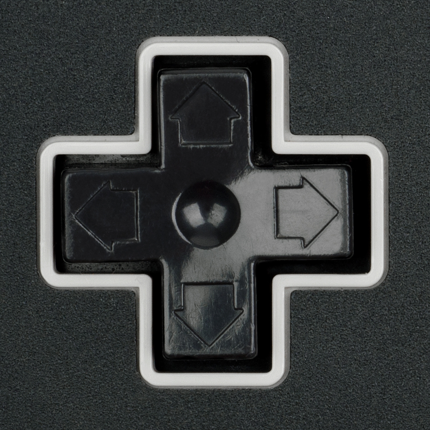
Overloading a single button with tap, double-tap, triple-tap, tap-and-hold, and combination sequences to access multiple functions. Each additional gesture hides a function behind a memorized incantation. The flashlight with ten button-press combinations and five strobe modes is the canonical example. The fix is either adding dedicated controls (a mode ring around the flashlight bezel) or reducing the number of functions to what a single button can cleanly handle (on/off only).

Deconstruction

Splitting a continuous analog control (dial, slider, knob) into discrete up/down button pairs. The natural acceleration of a twist or slide is replaced with repeated presses or a hidden long-press acceleration mode. Overshooting becomes common, requiring "station memory" or preset workarounds that add complexity. The fix is using the analog control where the interaction is continuous (frequency tuning, temperature setting, volume). Where a button pair is unavoidable, firmware acceleration curves and visible position feedback (a progress bar, a numeric display) partially compensate.

Mode Abuse

Using a mode button to remap what other buttons do. The AM/FM toggle on a radio is a simple case. The worse case is when entering "clock set mode" silently remaps the volume buttons to hour and minute increment buttons. The user must remember which mode they are in, and a single missed mode press puts every subsequent input into the wrong context. The fix is separating the controls so each button always does one thing. Where modes are necessary, the current mode must be permanently visible, not just displayed briefly on a screen.

Touchscreen Displacement

Replacing a dedicated physical control with a touchscreen menu item. The control loses all three of Jenson's qualities at once. Discovery: the function is buried in a menu hierarchy instead of visible on the panel. Actuation: a flat glass surface provides no tactile targeting, so the user must look at the screen, find the control, and precisely tap it. Feedback: there is no travel, no click, and confirmation depends on the screen redrawing, which may lag. The canonical example is automotive climate control. A physical knob for temperature lets the driver adjust by feel without taking eyes off the road. A touchscreen version of the same control requires the driver to look down, navigate to the climate screen, locate the temperature slider, and tap or drag. The interaction that was peripheral becomes focal. The control that was always available is now behind a menu. The feedback that was instantaneous (knob position) now depends on software rendering speed. Touchscreens are appropriate when the task is genuinely complex, variable, or benefits from rich visual display (mapping, media browsing, text input). They are an anti-pattern when they replace a fixed, frequently used, single-purpose control that worked better as a knob, slider, or toggle. The test is simple: if the user needs to look at the screen to operate the control, and the previous version did not require looking, the touchscreen made the interaction less calm.
Scoring System


Each entry in this library is graded on five dimensions using a letter scale from A (excellent) to F (fails). The dimensions measure different aspects of calm quality. A cheap but robust, error-resistant button might grade C on delight and A on fault tolerance. That's a useful input, not a failure.

Delight and Sensuality

How satisfying does the interaction feel? The snap of a toggle, the weight of a knob, the click of a well-tuned tactile switch. This dimension is most sensitive to component cost, but layout, cap design, and firmware tuning can raise it 1 to 2 grades on cheap hardware.

Error Resistance

How hard is it to make the wrong input? Spacing between buttons, recessed switches, guards over critical toggles. A row of identical unlabeled buttons has low error resistance regardless of how expensive the buttons are.

Fault Tolerance

What happens when the user does the wrong thing, or when the component fails? A toggle switch fails gracefully: it's stuck on or stuck off, and you can see which. A touchscreen button fails opaquely: you don't know if the system received the input or not.

Legibility

Can the user read the state of the control without touching it? A toggle's position is visible from across the room. A flush capacitive button has zero legibility unless paired with an indicator. This dimension rewards controls whose physical position IS the readout.

Appropriateness

Is this the right control for this context? A rotary dial for volume control is appropriate. A rotary dial for entering a phone number is a relic. Appropriateness is not about the control itself but about the match between the interaction pattern and the task.

Cost Bands

Every entry annotates components at three price points. The goal is to show that calm quality is a spectrum available at every budget. A $0.10 tact switch under a well-shaped cap with proper debounce and spacing is calmer than a $5 switch mounted bare in a cramped layout. The library helps teams understand where to spend limited budgets for maximum calm return.

About This Library


This is a living reference of physical interaction patterns maintained by the Calm Tech Institute. Each entry documents how an object communicates its operation through form, material, and mechanism, and shows how to achieve that communication at different budget levels.

The library's intellectual foundation has two strands. The first is CTI's certification framework, which evaluates products across attention, periphery, durability, and sensory dimensions. The second is Scott Jenson's Design Can Be Free argument: that the majority of usability problems in consumer hardware are solvable with better layout, visual hierarchy, text labels, and defaults, often without changing the hardware at all, and that when better hardware does help, the cost is modest and the return is measurable in reduced support calls, lower return rates, and stronger brand perception.

The library is grounded in supply-chain reality. Entries include approximate cost bands, real-world product examples with buy links, specific part families from major manufacturers (Alps Alpine, Omron, C&K, NKK, Bourns, Grayhill, E-Switch, Marquardt, Panasonic), and explicit "calm with cheap parts" patterns that show how to get 40 to 60% of the ideal experience using stock, off-the-shelf components.

Entries are graded on five dimensions (Delight, Error Resistance, Fault Tolerance, Legibility, Appropriateness) using an A-through-F scale. The grading system is deliberately a spectrum, not a binary pass/fail. A cheap but robust, error-resistant button rates a C, not an F. The library helps teams talk about "how calm" something is at their actual price point and decide where to spend limited budgets for maximum calm return.

Additional categories and entries will be added over time. To add images, replace the placeholder elements with img tags pointing to your photographs.